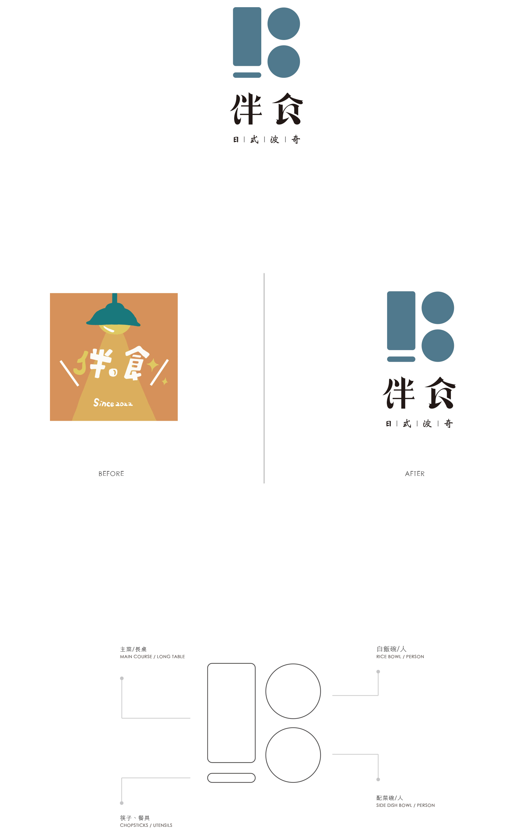
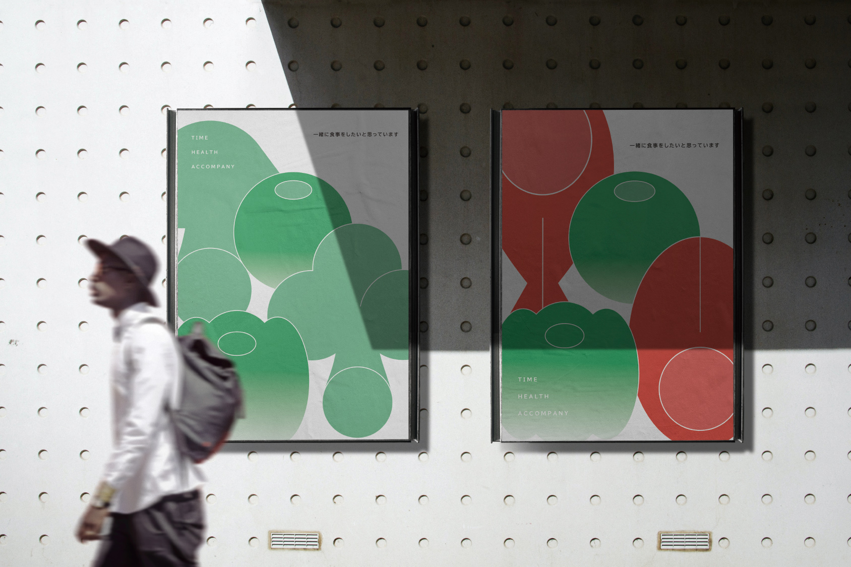
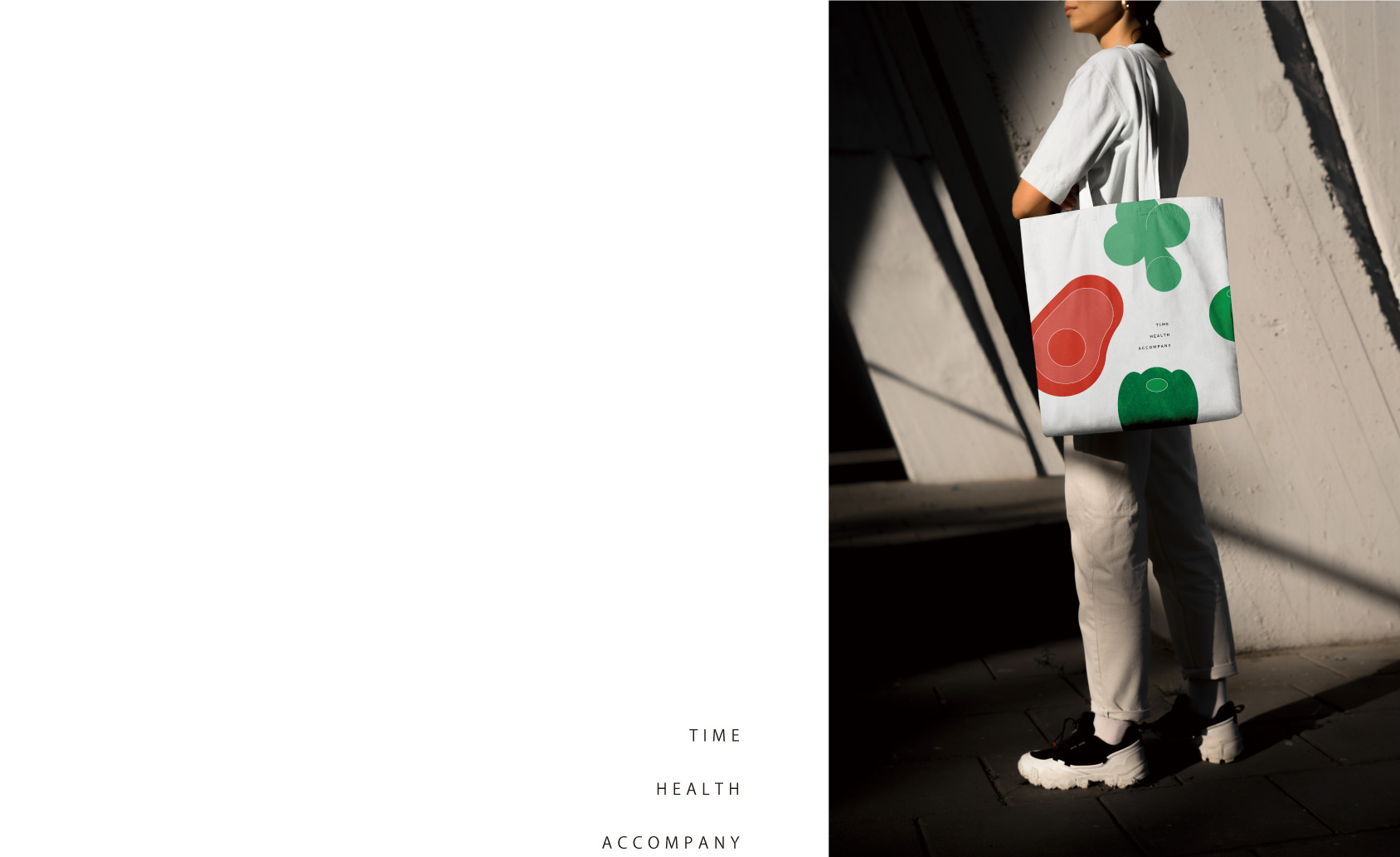
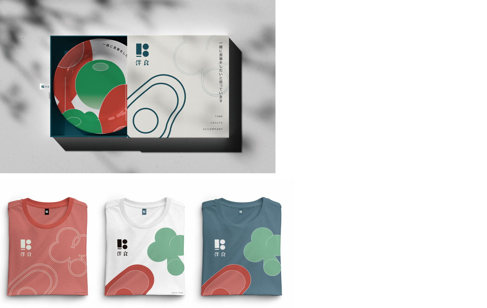
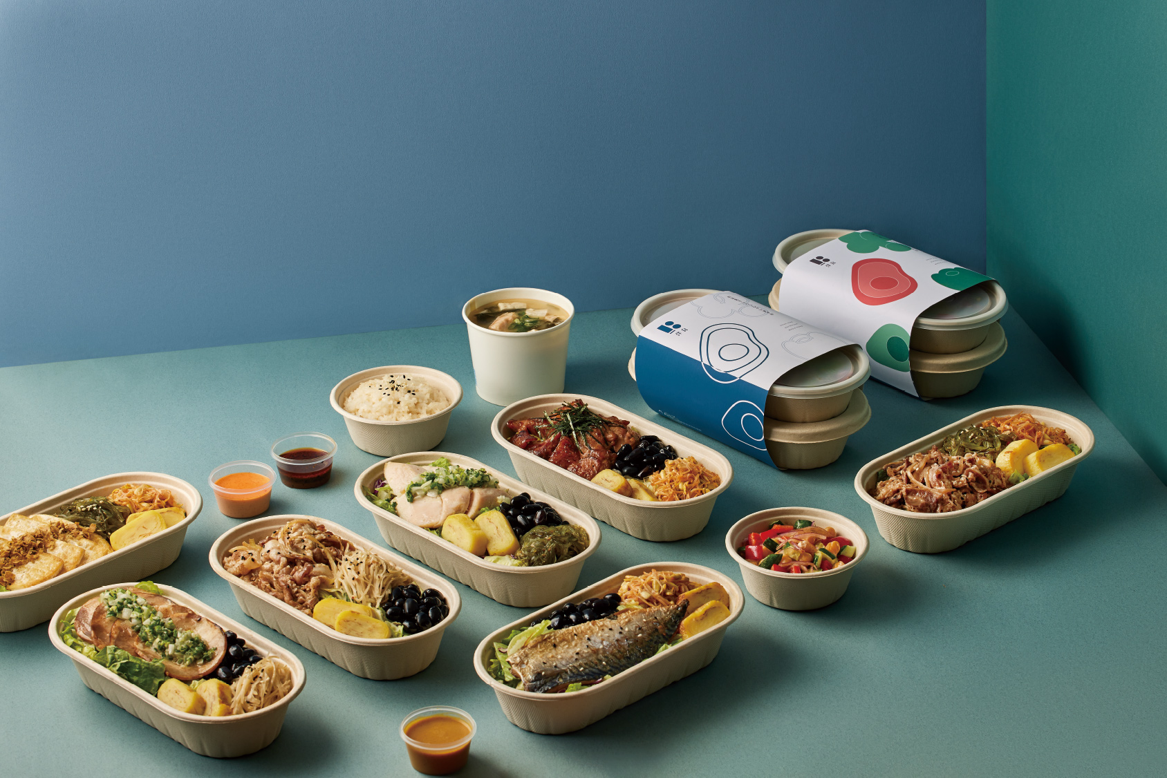
伴食

Brand Positioning
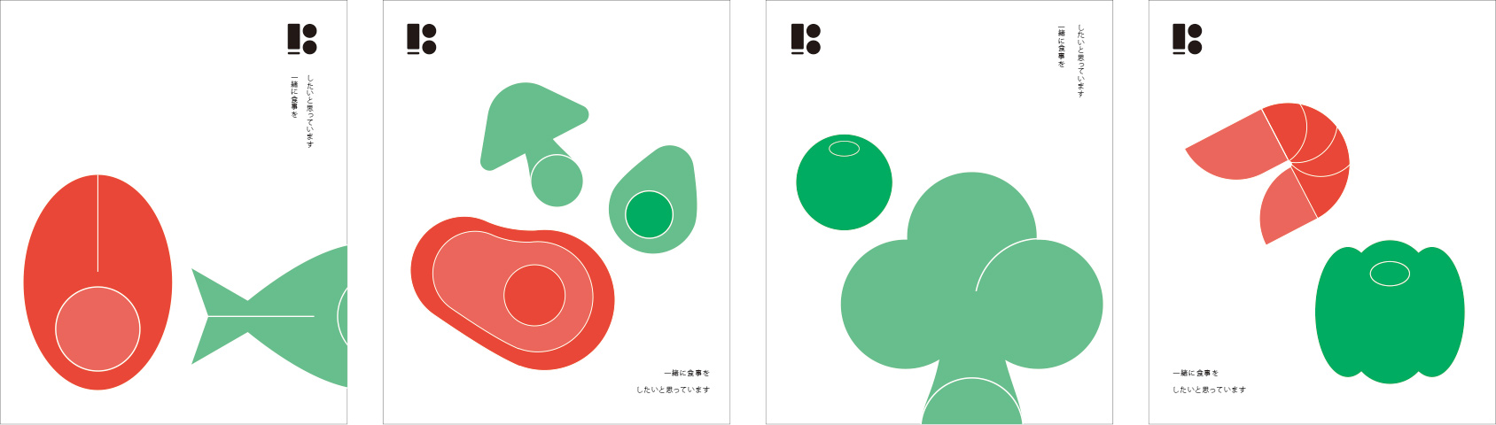
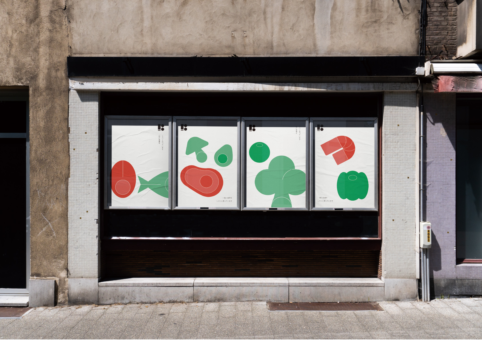
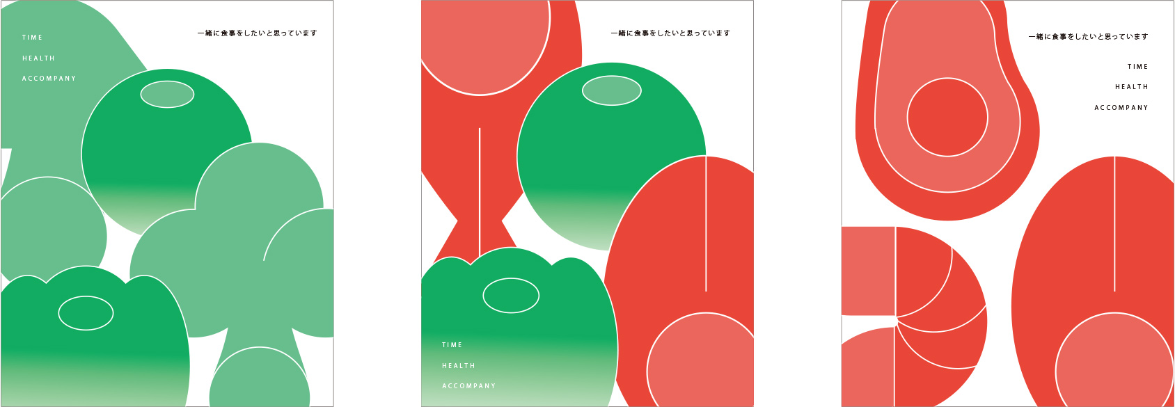
“just want to have a good meal with you.” This is the original intention and belief of BANSHI through food. In today’s busy society, fast food has become the first choice. also makes them forget about health. BANSHI hopes to exchange health for time, allowing guests to accompany the people they value.
「就想好好伴你吃個飯」這是伴食的初衷、也是信念。 在當代忙碌的社會裡,速食已然成為首選,工作的忙碌 讓人們喪失時間的同時,也遺忘了健康。 伴食希望能用健康換取時間,讓客人能好好陪伴重視的人。
  • Industry
  • Catering
  • Location
  • ban shi
  • Year
  • 2023
BRAND STRATEGY
  • The core spirit of BANSHI is rooted in health, time, and companionship. After planning with BANSHI we believe that a minimalist form is most suited as the logo for companion food. it enhances the customers’ recall and amplifies the imaginative space, allowing the logo to encompass all the BANSHI values of food.
  • Hence, we have drawn elements from health, stripped away complexity, and trimmed any excess, employing subtraction to remove the non-essential elements, retaining only the most significant core: companionship.
  • In order to elevate BANSHI’s recognizability, we have attempted to overlay the distinctive box shape of our BANSHI’S food with the image of two people sharing a table, thus multiplying the recognizability and the meaning.
  • 伴食主核心精神為健康、時間與陪伴,在與伴食進行品牌規劃後,我們認為簡約的形式最適合作為伴食的品牌標誌,簡約中能提高顧客的記憶點,並增加大量的想像空間,讓標誌能包含所有伴食寄望的品牌精神。
  • 因此我們從健康中提取元素,去除繁雜、剃除油膩,利用減法將不必要的要素刪除,只留下真正重要的核心,陪伴。
  • 同時為了提升品牌的辨識度,我們嘗試將伴食獨特盒型與兩人隨桌相伴的樣貌重疊,使辨識度與意涵相輔相乘。
lOGOTYPE
  • 採用色塊的排列呈現出純粹的簡約型態,將想像與多意涵保留於空間裡, 提高品牌辨識度。
  • The arrangement of color blocks presents a purely minimalist form, retaining imagination and multiple meanings within the space. The image of two people accompanying each other at the table side matches well with the silhouette of the meal box, enhancing brand recognition.
SYMBLE
我們去除過於可愛的元素,保留圖像的流暢性,提升品牌的精緻感 並加強圖像與核心精神【陪伴】的連結性。
BRAND STRATEGY
  • WE want to provide everyone with truly healthy eating, Not just ‘feeling’ healthy, But ‘attainable’ health.
  • Health is the most important wealth in life! Treat yourself well, take good care of yourself, Then you will have more time to accompany and care for those who love you.
  • “BANSHI” just wants to accompany you for a good meal.
  • 想給大家真正健康的飲食,不只是「感覺」健康,而是「吃得到」的健康。
  • 健康是人生最重要的財富!好好善待自己,把自己照顧好,就有更多時間 陪伴、照顧那些愛你的人。
  • 『伴食』就想好好伴你吃個飯

就想好好伴你吃個飯。

just want to have a good meal with you.

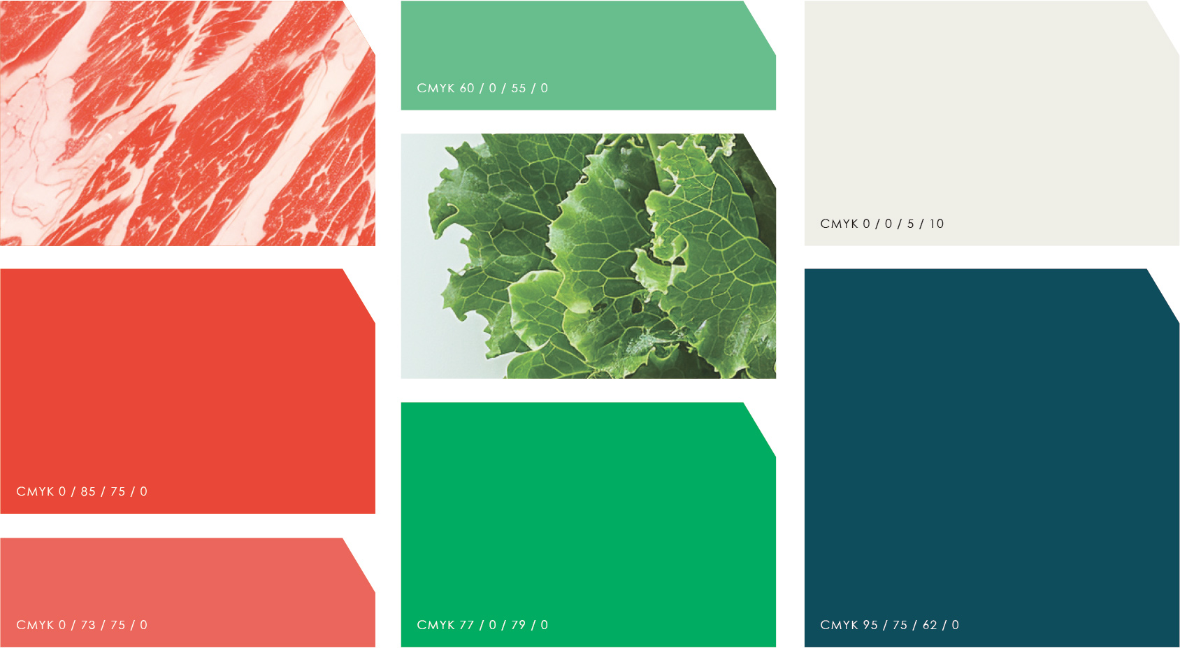
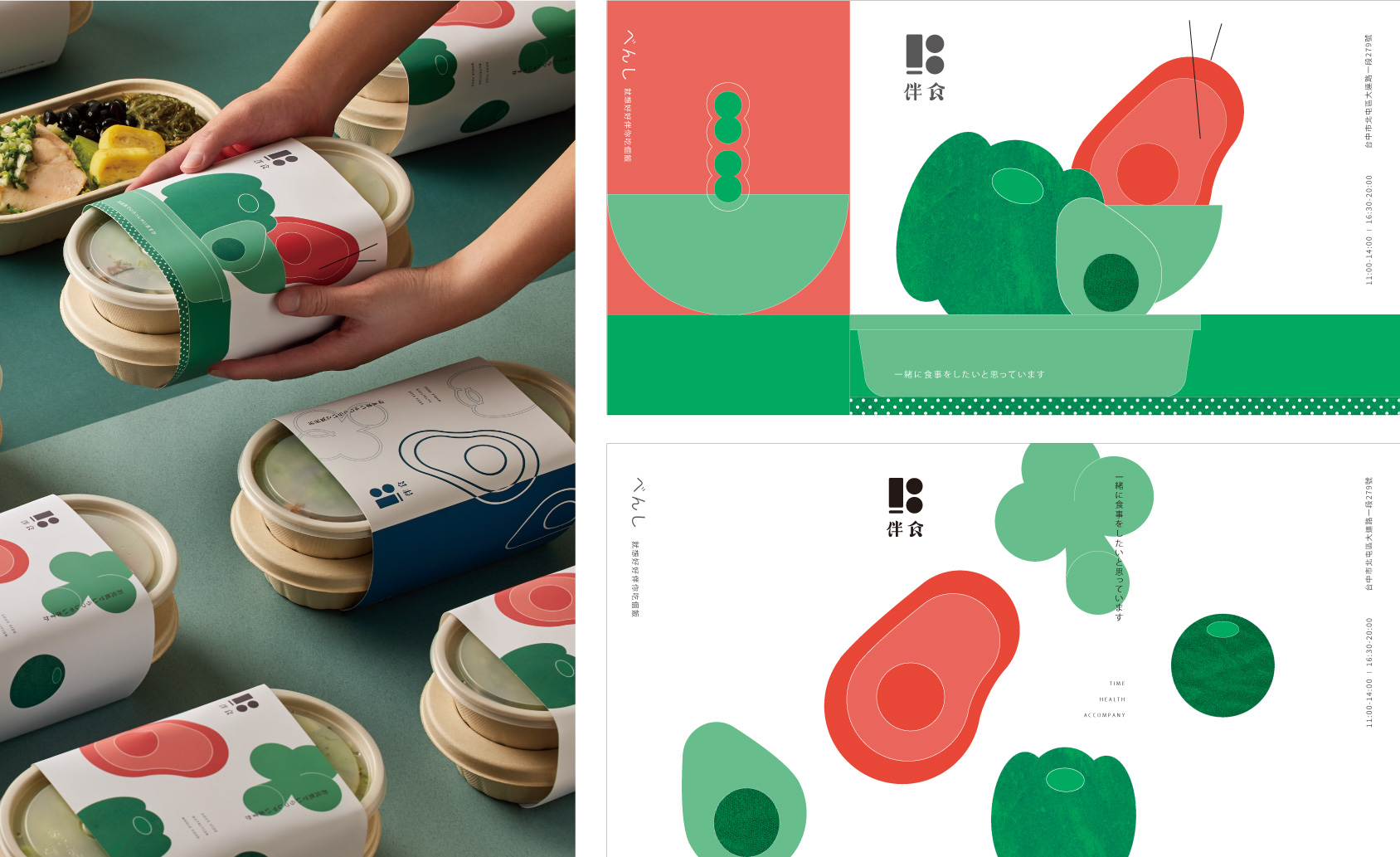
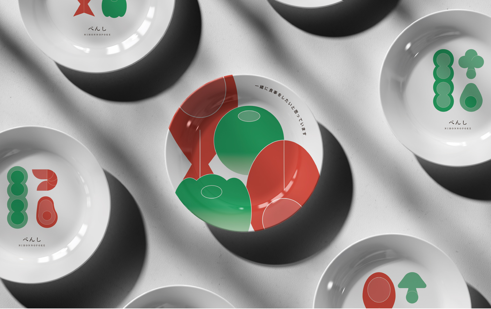
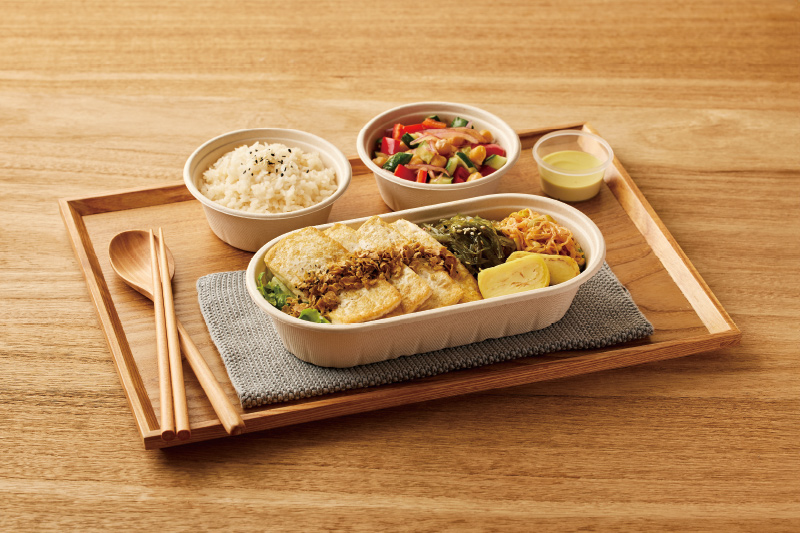
Color selection strategy

波奇菜色源於海鮮,在運用與大海相符的藍色之時,我們希望他帶給顧客的感覺會是清爽,負重不高的氛圍。

因此我們降低明度與彩度,讓色彩自發的傳達訊息,保留著精緻、食慾,卻不過度張揚。
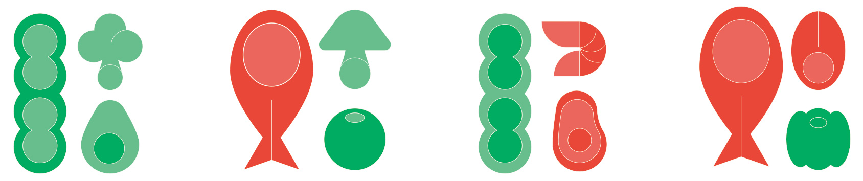
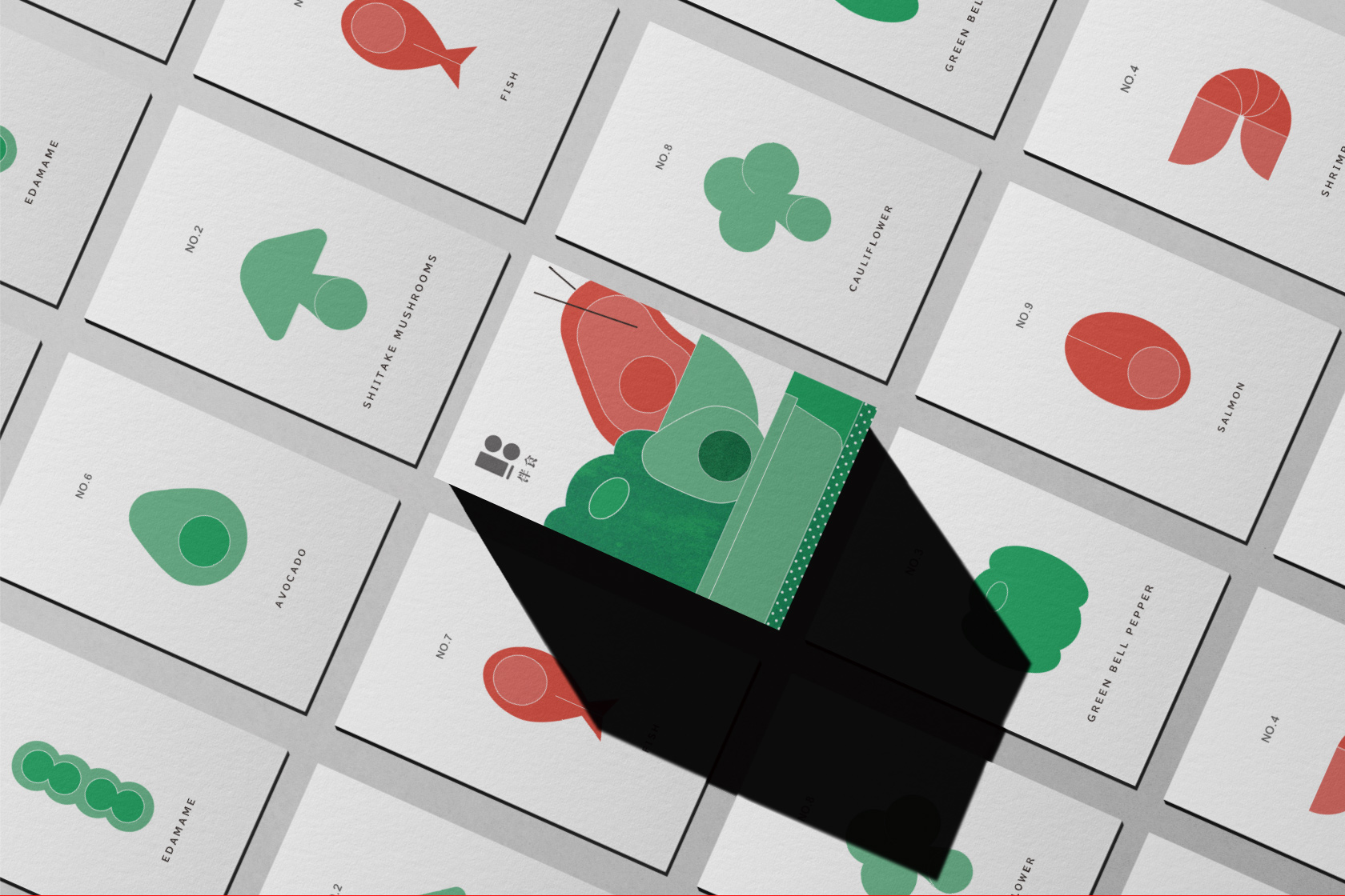
Complementary color

與較為低調的藍色做出對比,將食材特有顏色鮮艷化,為伴食增添新鮮感。

Auxiliary graphics
  • 簡化一般波奇常見菜色,將其與LOGO形象連結,皆轉變為色塊相接, 同時進行導圓角去尖銳,讓整體形象更親民、適合相伴的意象。
  • Simplify the common dishes of a general “Bocci” style, linking them with the LOGO identity, transforming all into connected color blocks, while also implementing rounded corners to remove sharpness, making the overall image more approachable and suitable for a companionable imagery.
Application
  • 藉由多種編排的手法,讓整體平面富有創造、生動力,使平面躍然於紙上;而這種編排手法也近似於波奇餐點的組成方式,由多種不同的單品食材,創造截然不同的口感。
  • By utilizing various layout techniques, the overall design becomes more creative and dynamic, making the graphics leap off the page. This approach to layout is also similar to how Poke bowls are composed, using a variety of different ingredients to create vastly different textures and flavors
Examples of practical application of auxiliary graphics
The culmination of all the graphic poster designs.